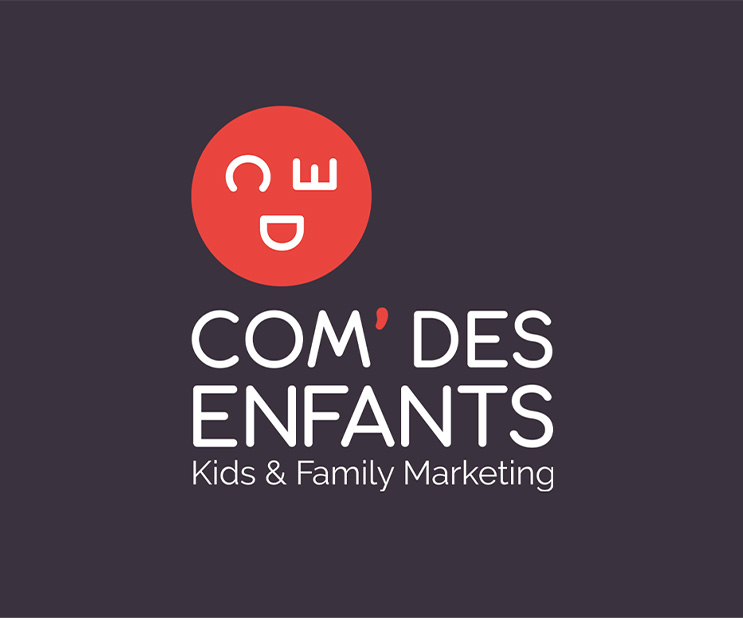
At the beginning of this year, Com' des Enfants offers itself a new graphic universe as well as a new identity to be in agreement with its values.
Why now?
Adolescence is in childhood, one of the major periods of life, just like adulthood or old age (third and fourth ages). We have left the age of reason and have built and developed our ideas and desires. We are ready to enter a new phase of growth and evolution.
Nombreuses furent les réflexions autour de ce renouveau.
Quelle était la meilleure manière de transposer notre mission en une image ?
The human being above all
Com’ des Enfants, c’est une agence qui place l’humain au cœur de ses stratégies pour créer des liens pérennes entre les consommateurs et les marques.
C’est cette vision d’agence, pleinement axée sur le Customer marketing, qui nous a permis de mettre un visage sur notre renouveau iconographique nécessaire.

In full form!
In our new logo, the initials of Com' des Enfants now form the facial elements of a smiling emoticon. This modern icon represents the warmth, the friendliness, the joy and the impertinence that we wish to impulse in each mission that is entrusted to us. A strong symbol that will live as a free electron on each of our media, hoping that in return it will make you smile too!
Its roundness symbolizes the alliance, the softness and reminds the childhood, the youth.
Com' des Enfants is also an apostrophe that reigns and characterizes this name, like a link between brands and consumers or between generations. It also supports the agility and reactivity that we show as a team in each of our projects and as such deserves to become a strong and dynamic element of our graphic identity.
See life in coral
The colors, meanwhile, are transformed, modernized and now live fully within our identity. A passionate, flamboyant coral red that recalls energy, dynamism and vivacity. A color tinged with positivity that is reminiscent of the vitality of children, the power of the family and parental strength.
Opposite the coral is a deep, elegant charcoal gray that echoes the metal, a symbol of calm and contemplation in Feng Shui. A balance between the many facets of life, but also those of our projects.
It is not without emotions that we present you this new face. On the contrary, we hope to create many more with you, as projects and beautiful ideas come to life.
